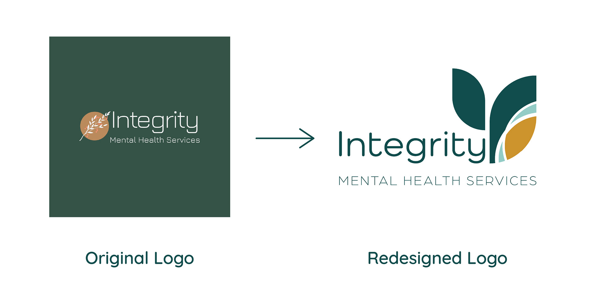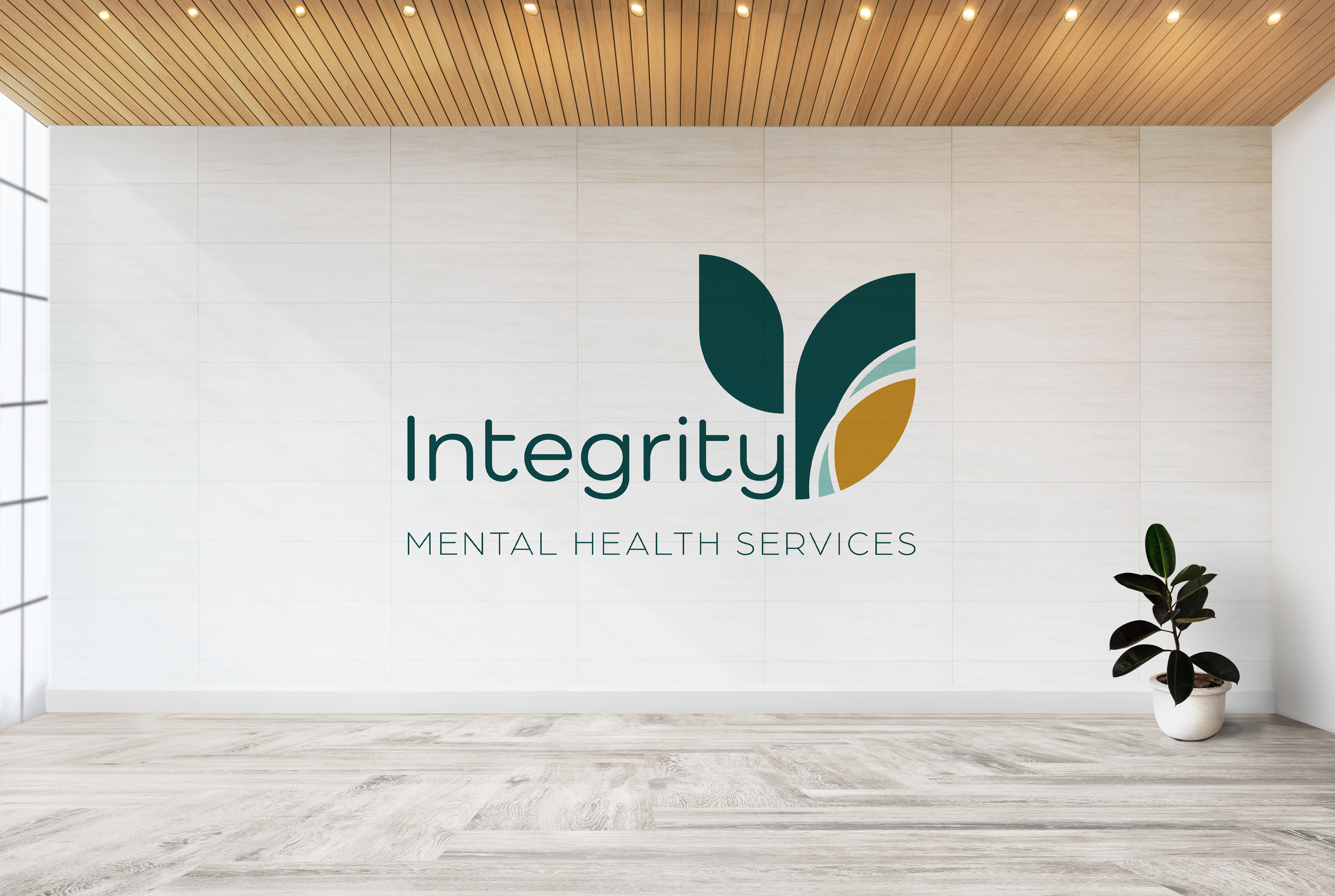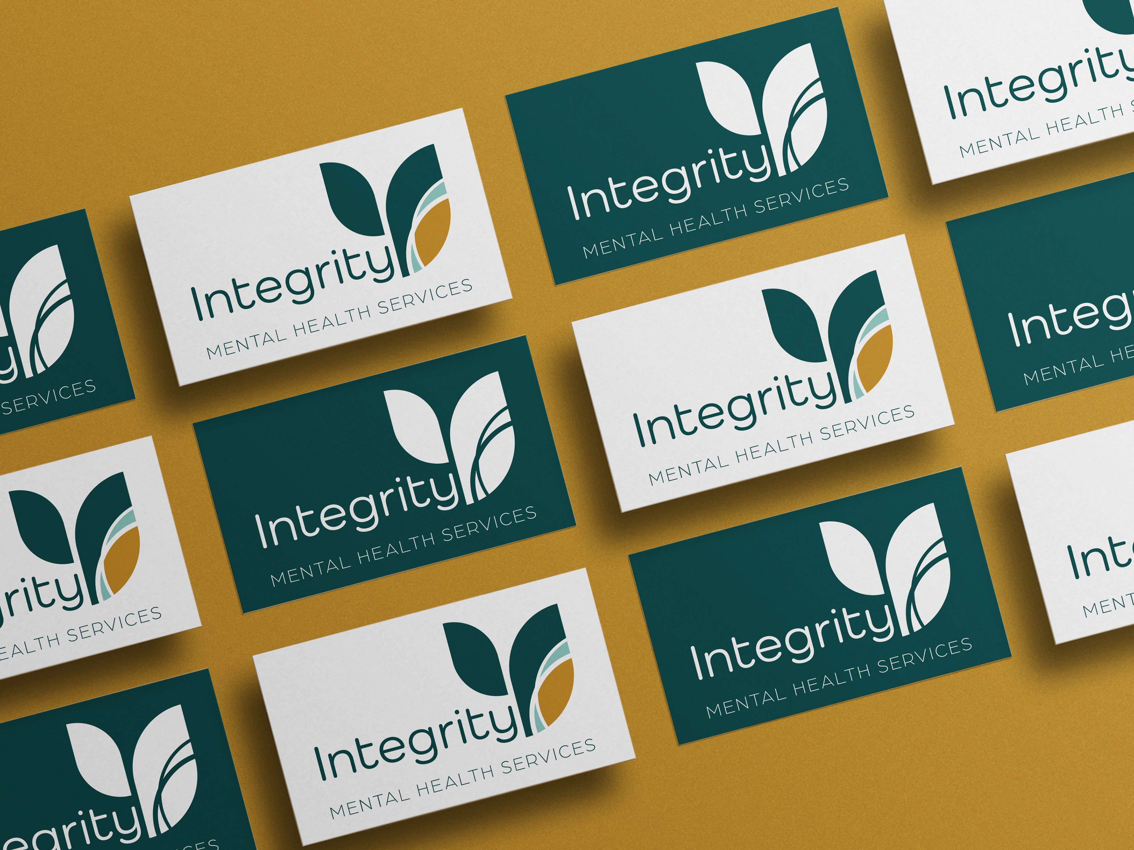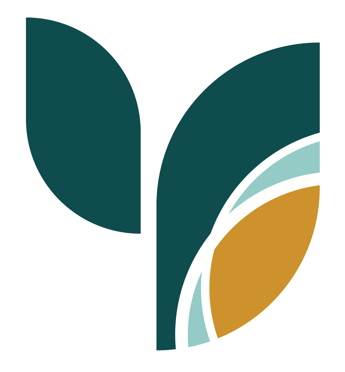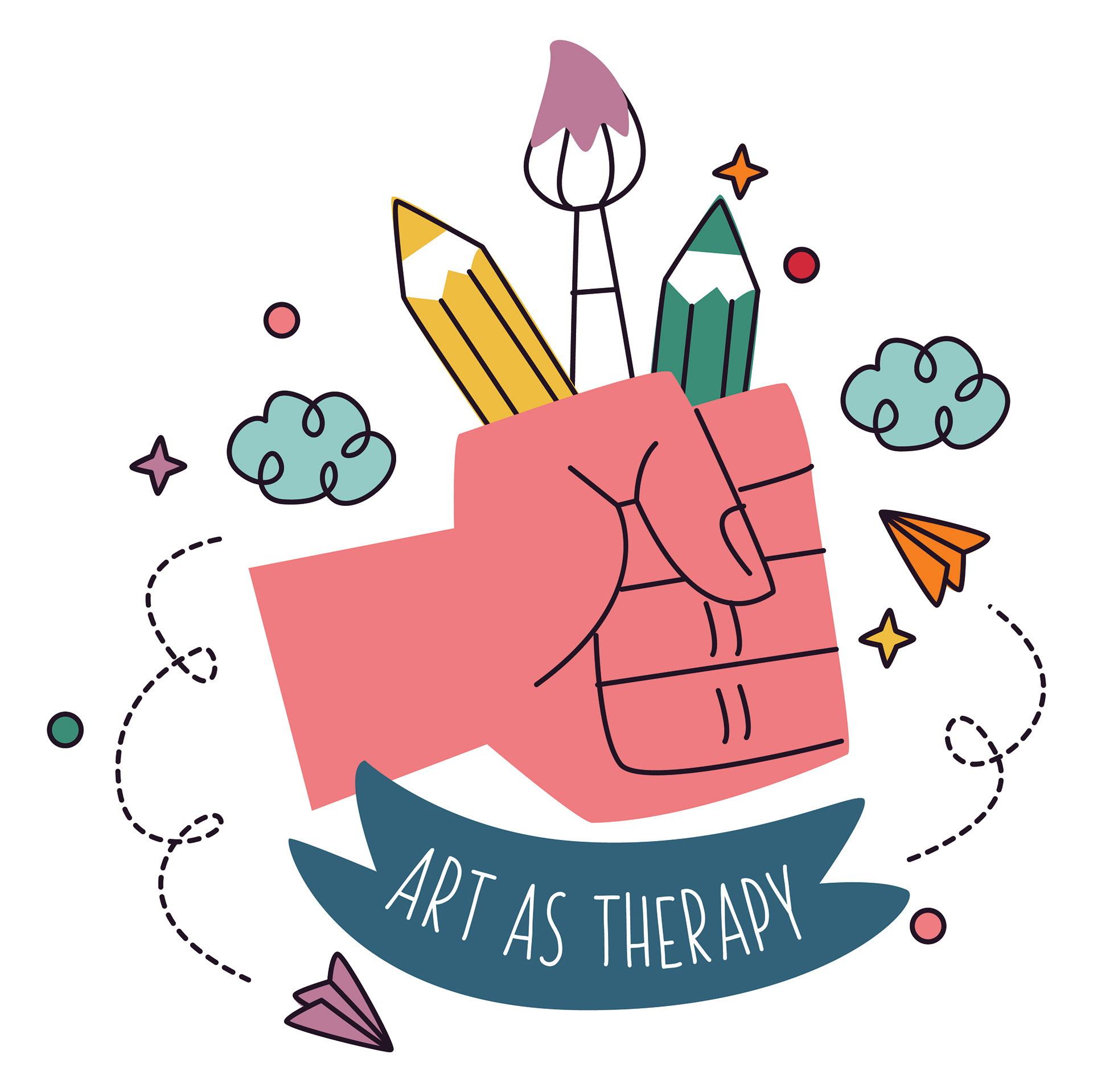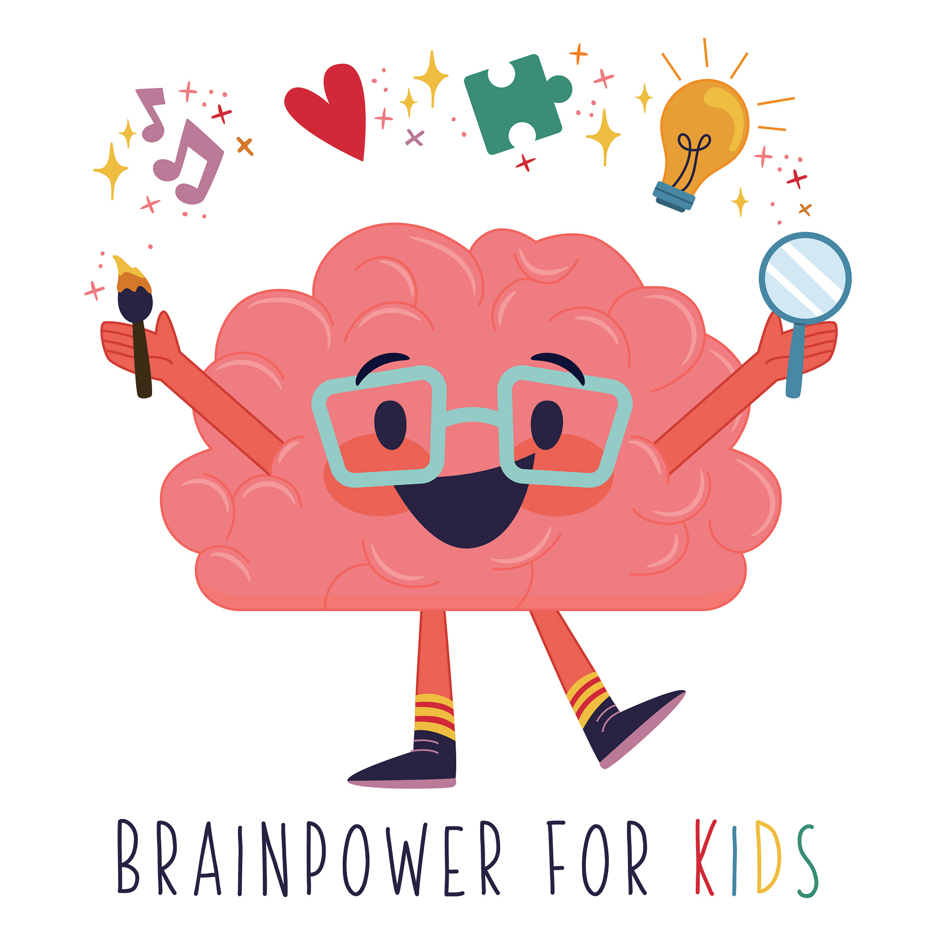
Integrity Mental Health Services offers a variety of therapy options for people in Northeast North Carolina. Located in downtown Elizabeth City, NC, it is owned and operated by Kara Miller. She created the original logo herself, but reached out to me when she realized that the logo could use a professional redesign. Kara had found from client feedback that the name "Integrity" appeared too harsh to some, but she wanted to keep it for its meaning of wholeness. I softened the font to one with rounded edges for a more friendly, welcoming feel. She loved the green from the original color palette, so I kept that for its earthy, grounding implications. For a bit of energy and vitality, I changed the brown to a warm gold, and rounded out the color palette with a calm aqua blue. I kept the idea of a plant element (for growth) in a more modern, deconstructed form of a plant or flower as an icon. In addition to the logo, Kara also wanted some custom graphics for her programs "Art As Therapy" and "Brainpower For Kids."